Andrijana Bakracheski

UX/UI Designer based in The Netherlands

About

I'm a UX/UI designer with 3.5 years of experience in a marketing tech agency, working on recruitment and e-commerce websites for small to mid-sized clients. My work focuses on improving conversions and overall website performance. I'm organised, detail-oriented, and comfortable managing multiple projects at once. I collaborate closely with CRO specialists, marketing, and engineering teams and enjoy working in international and multicultural environments.

Connect

LinkedIn Email

Experience

CV
Andrijana Bakracheski
01

TEVEO

Small Giants · E-commerce · 2025 - 2026

€50M in annual webshop revenue

TEVEO's Shopify site was originally built for a niche leggings brand, but they had grown into a unisex sportswear company. With 24+ product drops a year, this caused real issues: the website became harder to navigate, customers struggled to find products, and the team had no insights into what was driving conversions.

I took ownership after the lead designer set the visual direction, translating those concepts into a scalable design system with a focus on CRO and a smooth handoff to dev.

  • Designed a library of 40+ reusable components and templates for a scalable design foundation.
  • Redesigned navigation to keep TEVEO's growing unisex range easy to discover.
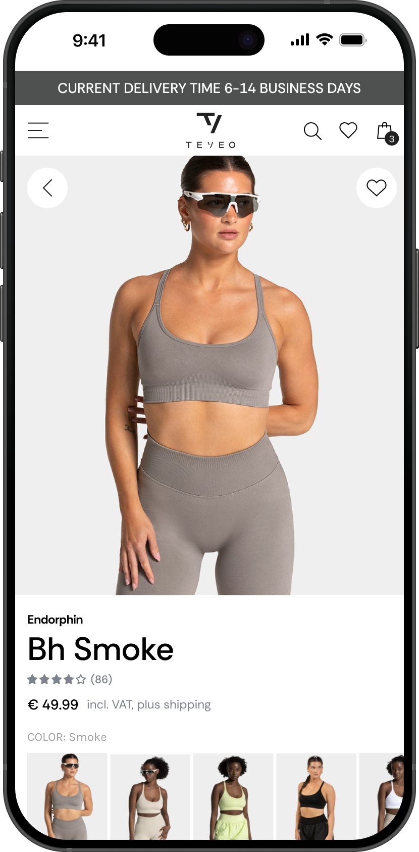
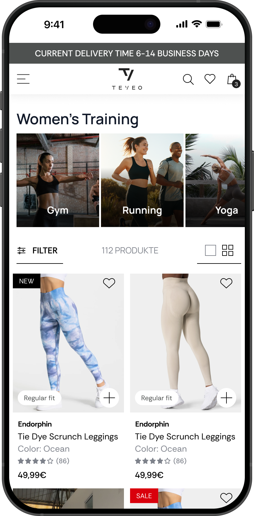
  • Redesigned key pages (Homepage, PLP, PDP, About Us) to improve readability, highlight trust signals, and clarify the path to purchase.
  • Collaborated with PM, CRO, Dev, and Teveo marketing team to align on goals, constraints, and user needs.
Teveo e-commerce product page mockup
Teveo product listing page mockup
02

Verstegen

Small Giants · Website · Design · 2025

10+ Monthly revenue through the webshop

Verstegen's WooCommerce website no longer matched the needs of the business. Products were difficult to find, product pages lacked the information customers needed, and frequent checkout issues hurt the buying experience. B2B customers were sent to a separate website, creating an inconsistent brand experience, while limited analytics and poor accessibility made it difficult to optimise the experience.

As the UX/UI designer, I worked closely with the client lead, CRO specialist, and frontend developers throughout the project. We started with a client meeting to define the requirements for the new website. I redesigned the entire website, transforming the existing catalogue style website into a more user-friendly e-commerce Shopify platform.

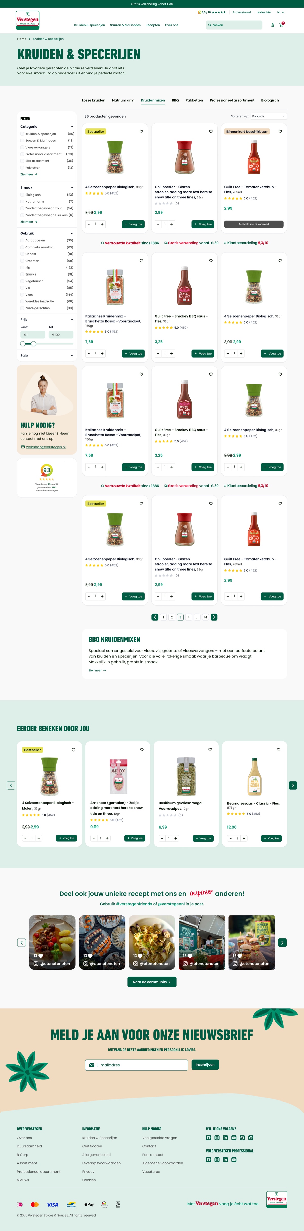
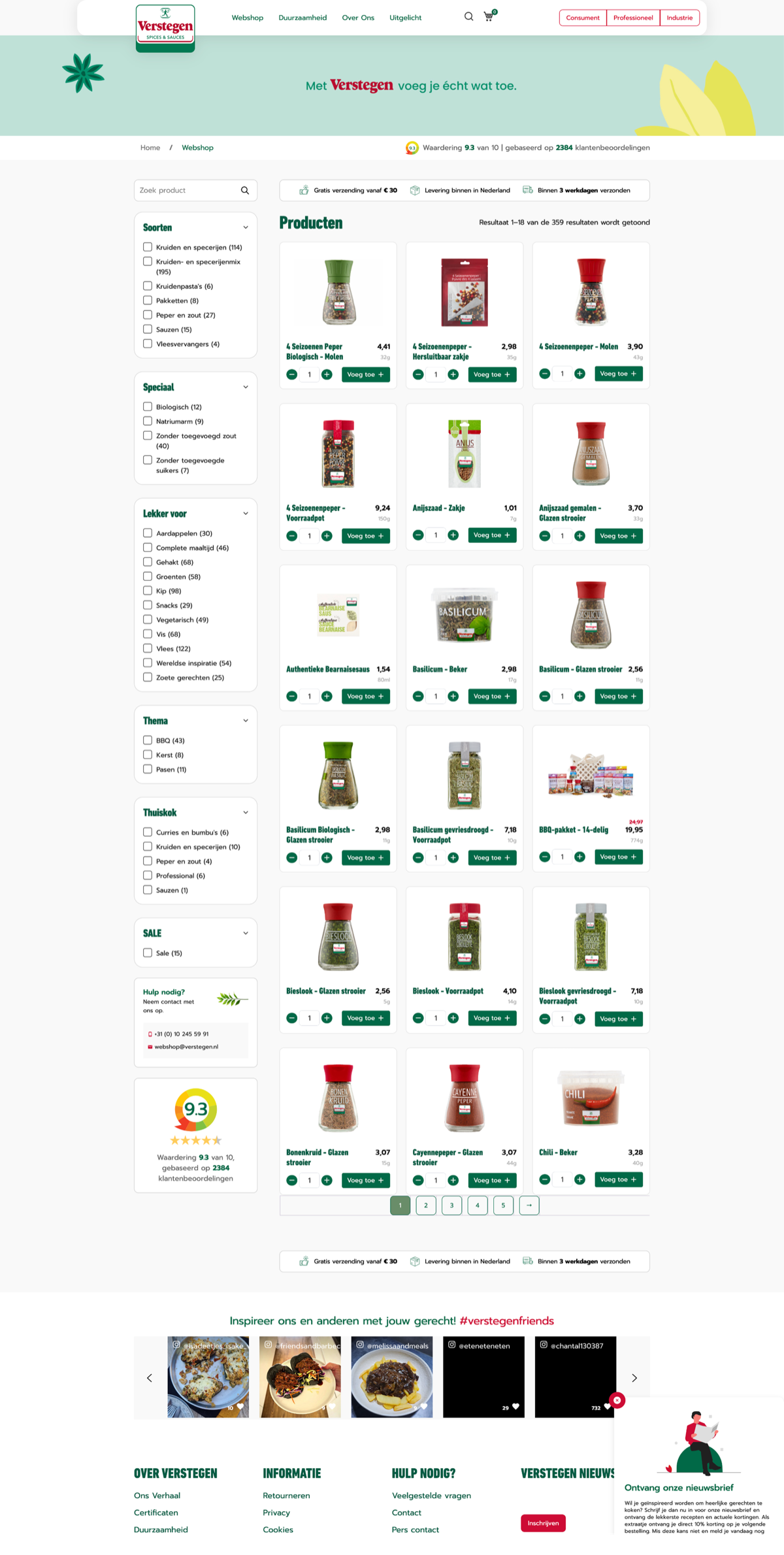
  • Ran user interviews and card sorting to define how people expect products to be grouped, then redesign the category structure and navigation around that
  • Removed the old "Professionals" redirect, bringing B2C and B2B into one shopping experience
  • Worked with CRO to set a clear goal for each page type, so pages were designed with a purpose
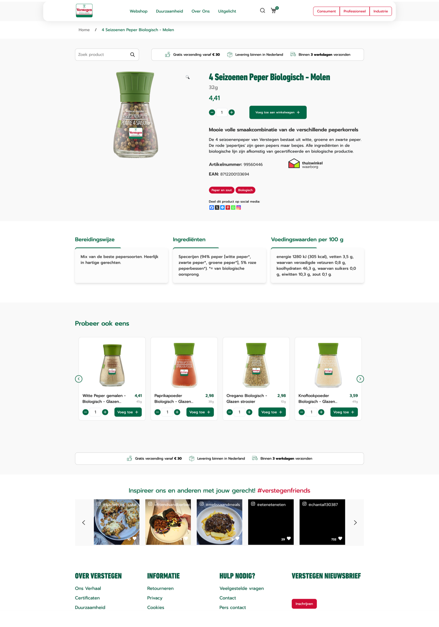
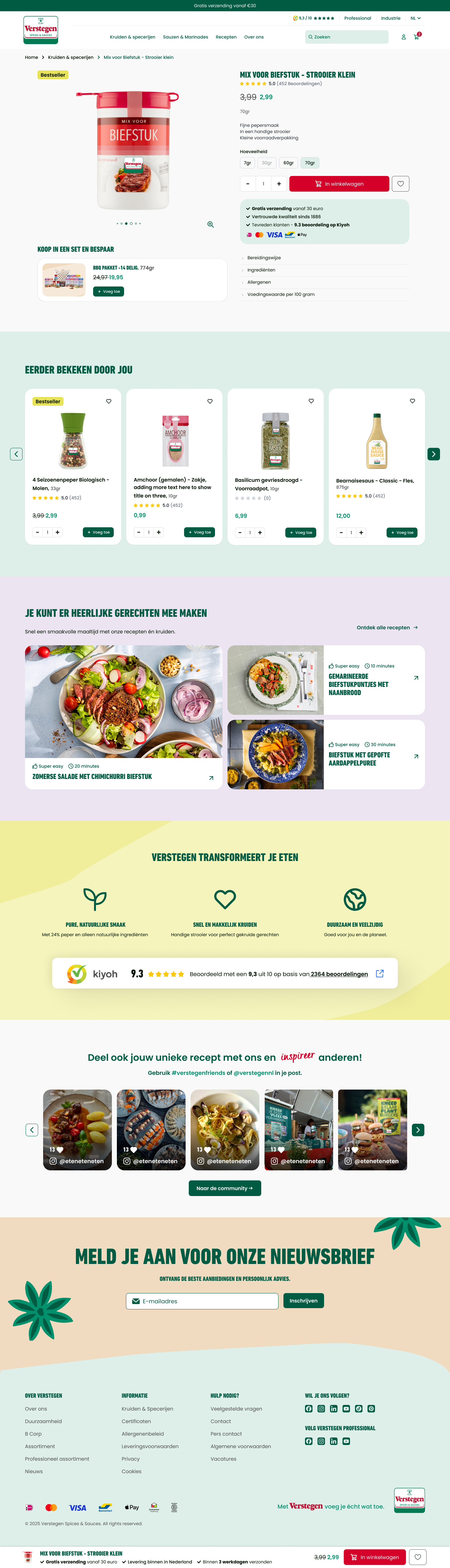
  • Optimised PDPs with clearer USPs, trust signals, and reviews, and added expandable sections to help customers quickly find the product details they need
  • Designed to meet basic WCAG accessibility requirements and created consistent visual design
  • Handed off a fully specced Figma file with all assets ready for development
See live website
verstegen.nl/mix-voor-biefstuk
Verstegen new PDP design Verstegen old PDP design
Before After ← Drag to compare →
verstegen.nl/kruiden-specerijen
Verstegen new PLP design
Verstegen old PLP design
Before After ↑
Drag to compare
↓
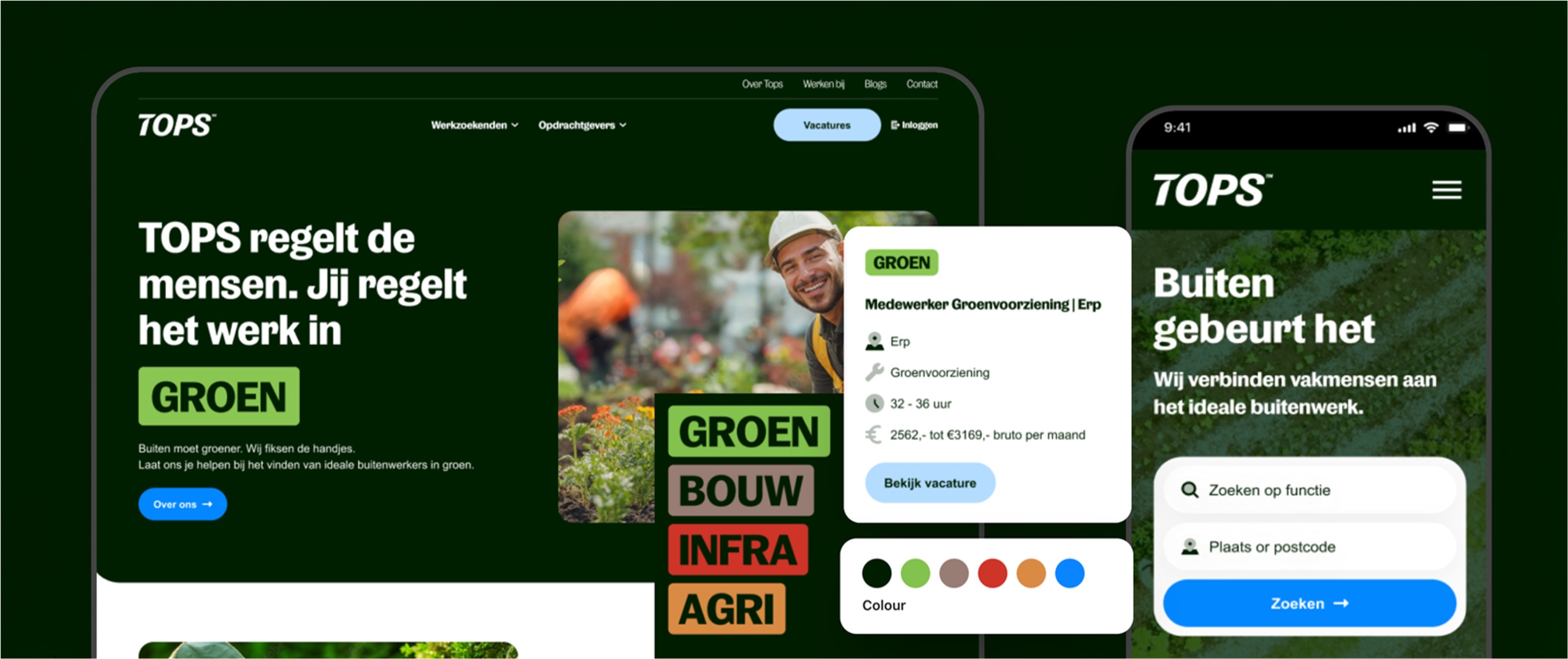
TOPS recruitment website, desktop and mobile
03

Tops

Recruitment · Storyblok · 2025

TOPS needed a user-friendly recruitment website that made it easier for candidates to find relevant jobs across four sectors: Green, Agriculture, Infrastructure, and Construction. The existing site was cluttered, with unclear navigation, competing CTAs, and job listings that were easy to miss.

I was responsible for the UX/UI redesign of the TOPS recruitment website, working closely with copywriter, the CRO team, and developers to improve the user experience and create a flexible design system that supports the company’s growth.

  • UX audit: Reviewed the existing website to identify navigation problems, unclear buttons, cluttered layouts, and job listings that were easy to miss.
  • Information architecture: Improved page structure to help users find relevant jobs and services more easily.
  • UI design system: Created reusable components with consistent layouts, spacing, and behaviour across four sector brands in Figma that developers built in Storyblok, to support independent page creation.
  • Scalable page design: Built flexible components in Storyblok, allowing the internal team to create and update pages independently.
  • Sector-specific styling: Adapted colours, labels, and imagery for Green, Agriculture, Infrastructure, and Construction while keeping the overall experience consistent.
  • Vacancy experience: Improved job cards and vacancy pages to make key information easier to scan and the application action easier to find.
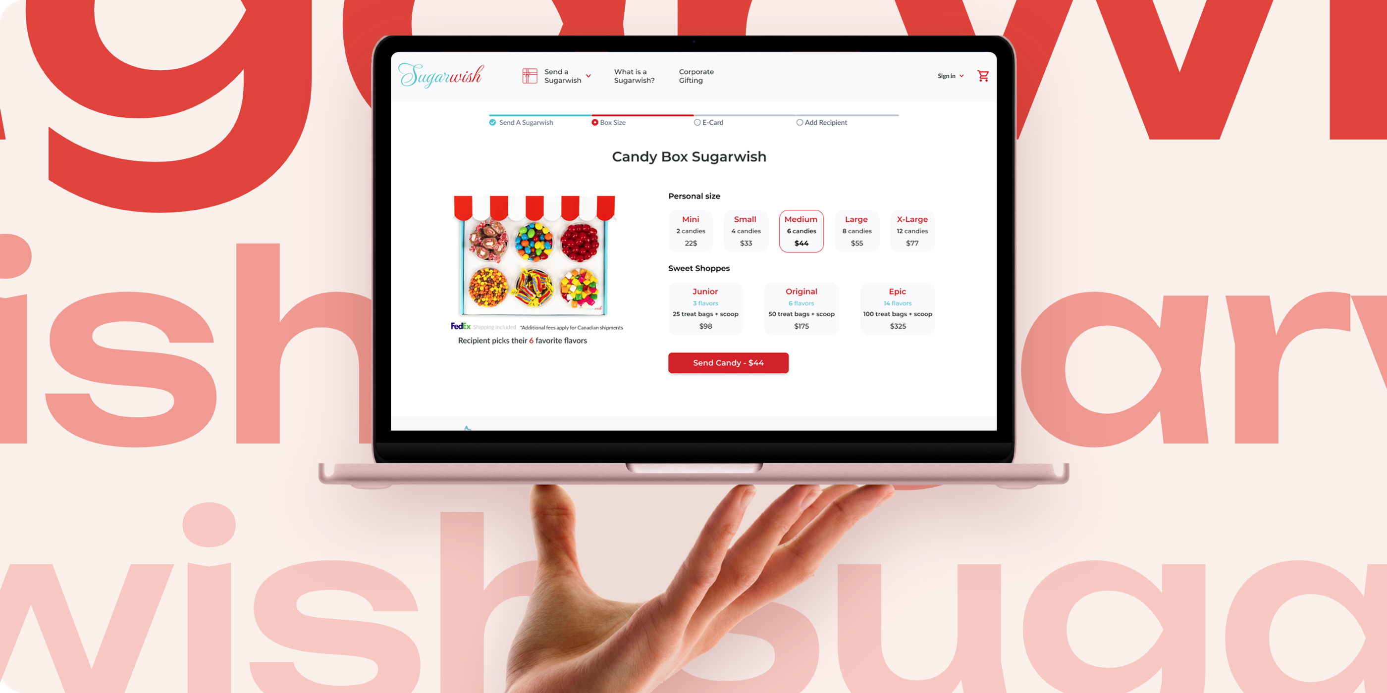
Sugarwish ordering flow redesign
04

Sugarwish

Brainster UX/UI Academy · Gifting e-commerce · 2020

Sugarwish lets a gift buyer send a digital eCard with no mailing address required, and the recipient picks their own treats. But the existing ordering flow led users to give up when confronted with certain choices, usability testing showed the highest drop-off was on the "choose an eCard" and "choose a size" steps, and user interviews found some visitors suspected the site of being a scam because of an unclear sending flow.

As part of the UX/UI Academy at Brainster, I worked in a team of three to redesign a subset of screens on Sugarwish's existing website, without breaking the consistency of the live product. I led stakeholder and user interviews, usability testing, journey mapping, wireframing, and prototyping in Figma. Our solution was chosen by the company as the winning one among eight submitted.

  • Conducted remote usability tests and user interviews to identify ordering-flow pain points.
  • Added a progress indicator to clarify remaining steps.
  • Repositioned and clarified the best-selling “The Select” product.
  • Redesigned size-selection cards on PDP to show pricing and flavours above the fold.
  • Improved eCard browsing with a reordered occasion filter and fewer cards per view.
  • Moved login to the final step before payment to reduce friction.